![]() AdventureQuest 3D
AdventureQuest 3D
![]() Artix Krieger
| Friday, February 5, 2021
Artix Krieger
| Friday, February 5, 2021
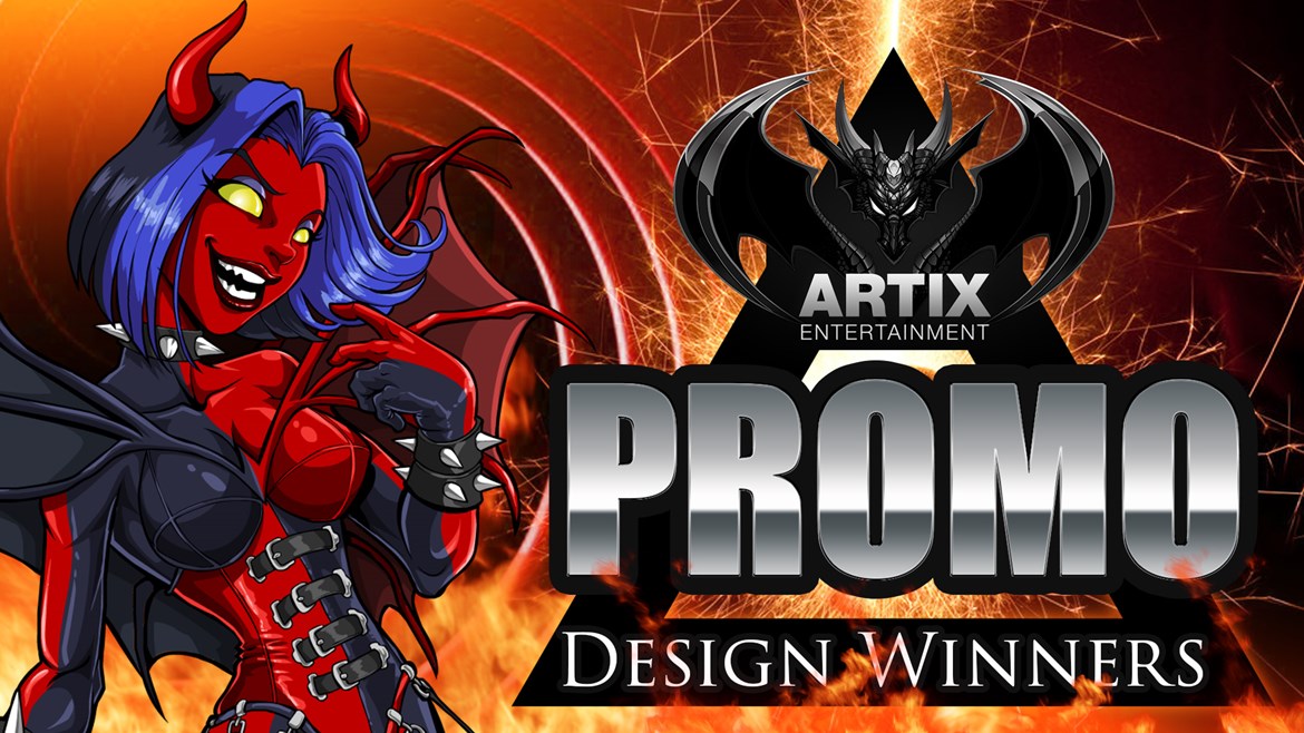
Amazing entries! Congratulations and thank you to all of the designers who entered this challenge. This was a 1st of a kind type of contest. Normally we do art and screenshot contests. But the goal of this contest was to create promo images. I (Artix here, hi!) have been making images like this multiple times a week for over a decade now. We need them for every release, email, social media post, and design notes post. This contest was a not-so-thinly-veiled way of searching our community for those who have the passion and skill for this type of thing-- both now, and for the future. Throughout AE history, we have watched talent grow and recruited new team members from contests like this-- including J6 & Dage. Even if you did not win a category, you landed on my radar. I now know to keep an eye on you :D
Well done everyone!
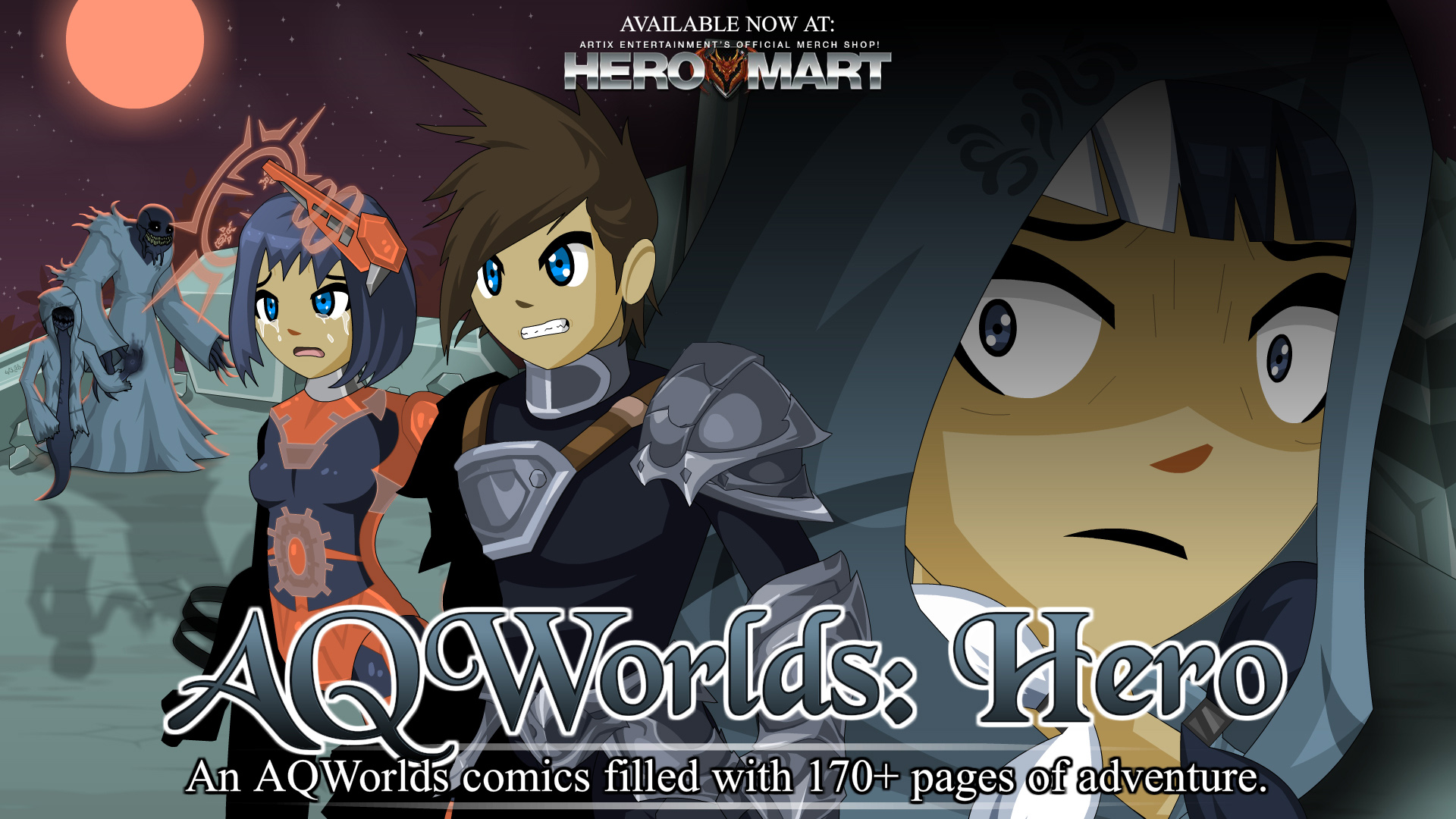
Grand Prize Winner: Adam1a1
The large expressive faces of these characters really make you feel something. Like, "What the heck just happened to the left... can you point the camera over there so I can see?" The typography is overall good. Big, bold main title in the definitive AQWorlds font. I would have deleted the small print above HEROMART, removed the colon from "Available Now at:", and added a little more padding between the words at the bottom. When you look at this promo you feel something and can easily figure out what it is.
Grand Prize Winner: Diogon
As Glisel often reminds me "Less is more". What I love about this piece, is how the blue energy ties it together. By using the negative space to pad the title, it is super easy on the eyes. The expressive character pops... and that little tiny glow in the right hand corner is more subtle than I am able to force myself to do XD
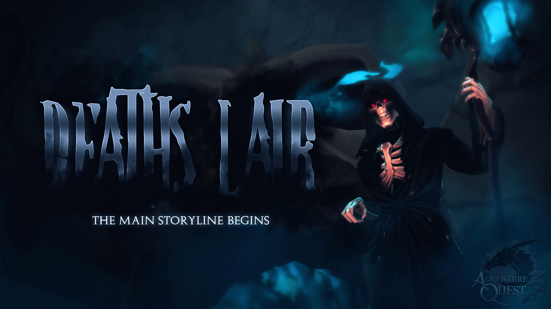
Grand Prize Winner: Cryotic
Typography is the placement of letters. Everytime I look at a magazine cover, I am mesmerized with how they are able to choose the size of the characters, and distance between them so perfectly. There is more to it than just that... sometimes you want the title to feel like a part of the composition. It was a tough choice, but I felt a touch of despair looking at the title "Death's Lair" being consumed by the darkness in this piece. The subtitle is "The main storyline begins" is bright, isolated, and easy to read. My only recommendation would be to add a little more spacing between the subtitle's letters. (Fun tip: The smaller the text, the more space should be between the letters. The inverse is also true.)
GrandPrize Winner: D Black Star
*THIS* was by far the most challenging category. So many entries had amazing compositions. I would like to give an honorable mention to Magnuse's entry which felt like an action movie poster! Also honorable mentions to Jessi Mai, Jigga, Guardian T1T, No-Uta, M a e l, Chiksilog, Ves, Cici Foxface, Cryotic, Kurato Wakiru, and everyone else in this contest who really put some work into combining images into a solid promo piece. It was cool studying your work. With so many good entries, this promo was selected because its composition demonstrated a combination of typography, call outs, existing art, original art, and unified colors. Recommendations to improve it include: moving the URL lower and making it larger, and moving the lens flare off of the Y. When a lens flare is used in the middle of a design, it draws your eye to it-- because we shoot a glance to the brightest thing. Flipping it horizontal and having it just sort of float between the words (all Michael Bay style) would bring your attention to the entire word block.
Hey! This was NOT AN ART CONTEST!
You crazy overachieving artists, always going above and beyond when you were specifically told not to. Here is your punishment... bonus prizes. (Because when I was little I used to add additional pages of art to my assignments and turn them in. One year, a Creative Writing English teacher gave me an "F" for adding art and going above and beyond-- because it was not part of the assignment. X_X So your punishment is... a bonus award of 2,000 Artix Points! Because every time I give you a prize for being creative and going above and beyond, it is revenge. Cold, hard, revenge against anyone who would stifle creativity. Take that Mrs. **********!)
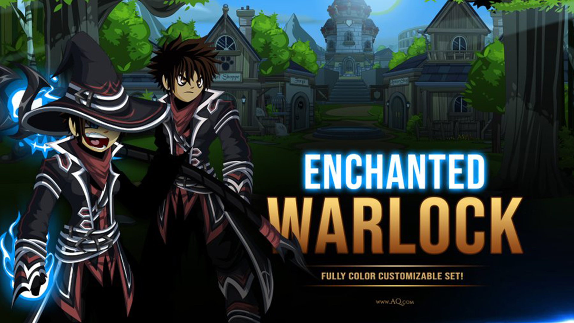
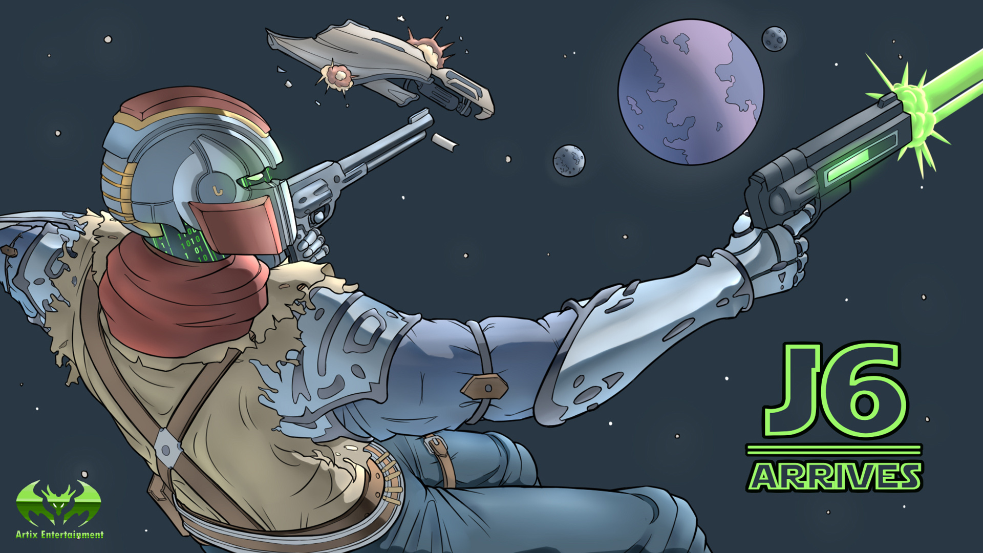
8-Bit AQworlds & J6 Arrives
Designed by: 996124
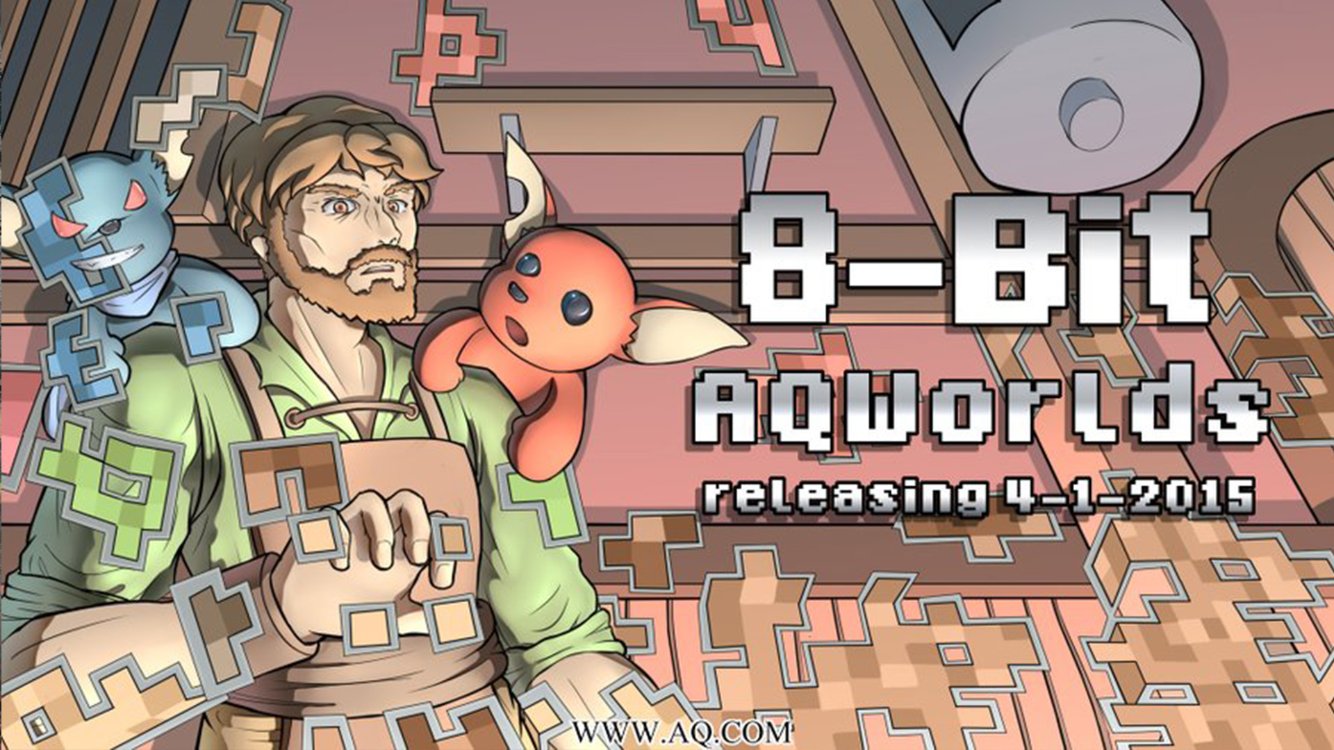
Woah, they created three pieces... O_O but limiting them to two so you are forced to check out their Twitter. XD
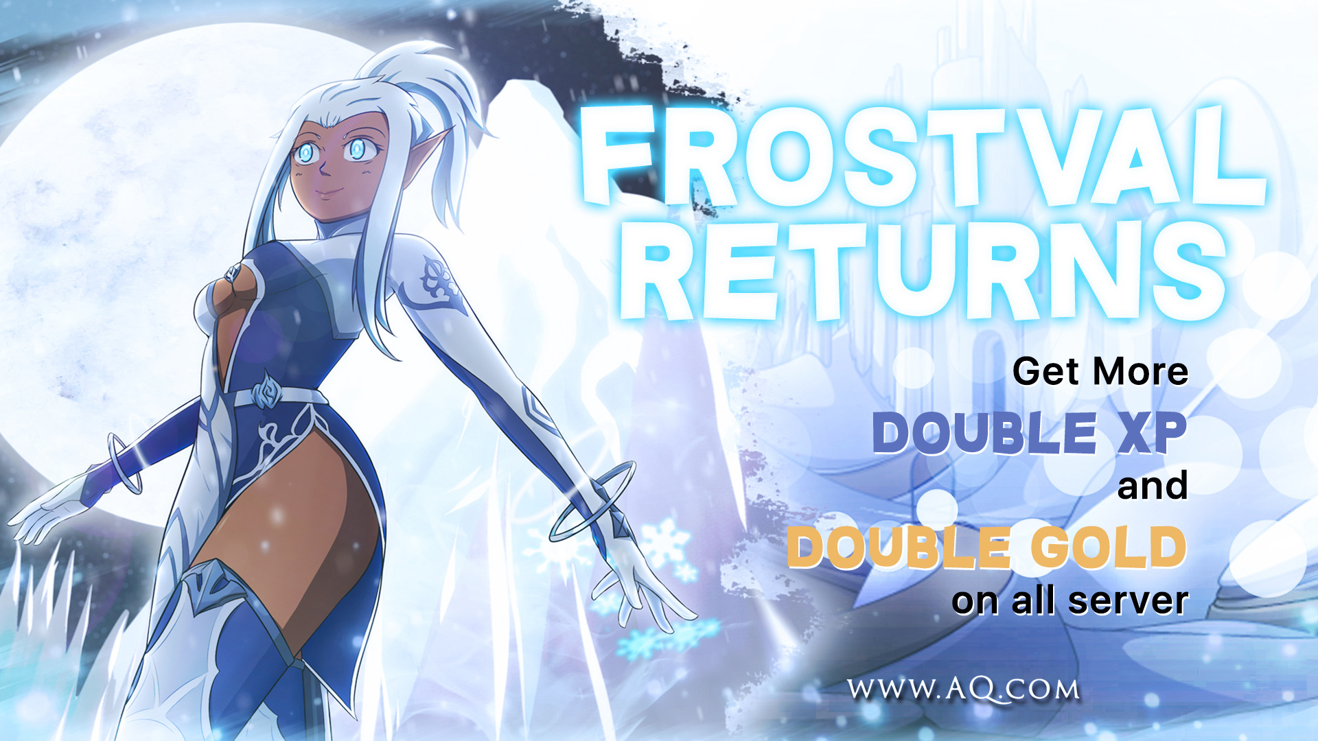
Frostvale Returns
Designed by: Mika Sasaki
The next piece is a little provocative. But instead of debating her fashion choices in the freezing cold of Frostvale, I want to focus on design. *eyes over here buddy*. If you look at billboards while driving on the road, you will often notice that 1. They always put the person on the left. And also 2. They are normally looking at you, or are looking to the right at the words on the billboard. I would flip this character so they were facing the "Frost Vale Returns". It is already perfectly lined up with her eyes, so your instinct as a viewer would go from the character to the words. (Then probably back to the character. Shame on you!)
Finally, I want to give an honorable mention to Dfallen Vengance who did a parody piece on Wiro Sableng. Because of your promo ad, I actually looked up who Wiro Sableng is and am trying to figure out how to buy and watch the movie. It should be noted that the most important part of a promo image is they get you to take action. Good job! *thumbs up* The only reason we cannot post the image is because it uses some actual art from the movie. This line of thinking to be continued in our next contest, the 1st ever "Artix Entertainment licensing rights, parody, and brand sponsorship acquisition contest!" (Kidding XD.... maybe >_> you really never know around here.)
Hope this contest helped you grow your creativity. Also, I hope you discovered or learned at least one new thing. I live by three rules, and invite you to share in them...
The AE Philosophy
Battle on!
Artix
 AdventureQuest
  AdventureQuest
  AQWorlds